
Assignment1 (color)
Change the old dark waiting feeling
By using Market "Activity" Advertising concept~
(The posters said "grand opening" and "New coming"
...for most of you guys can't read Chinese~^"^)

This poster mainly contains two parts
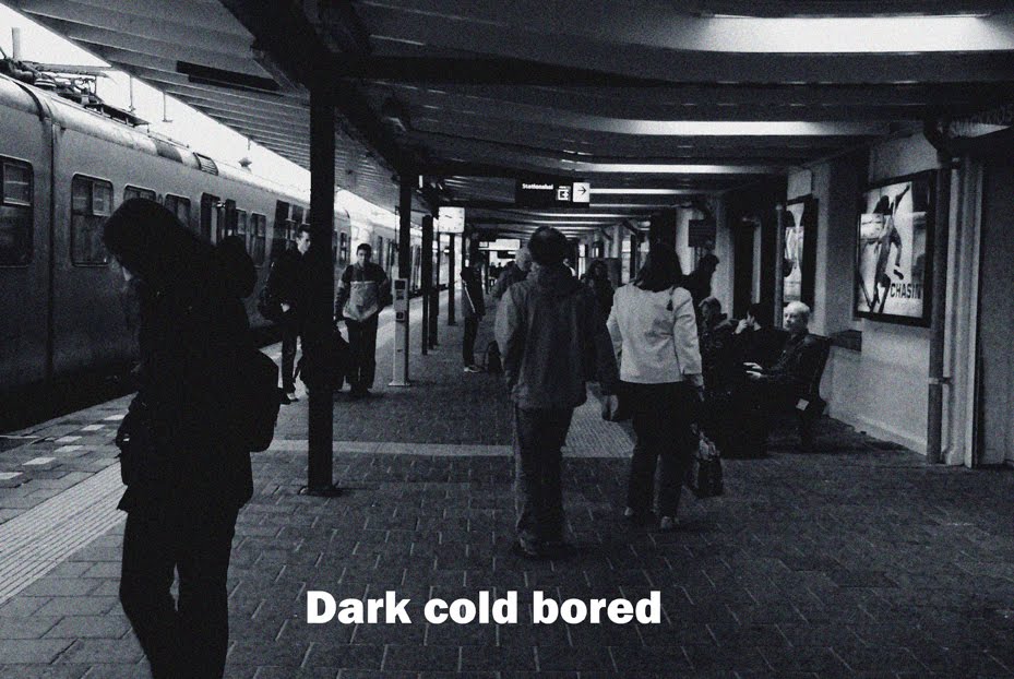
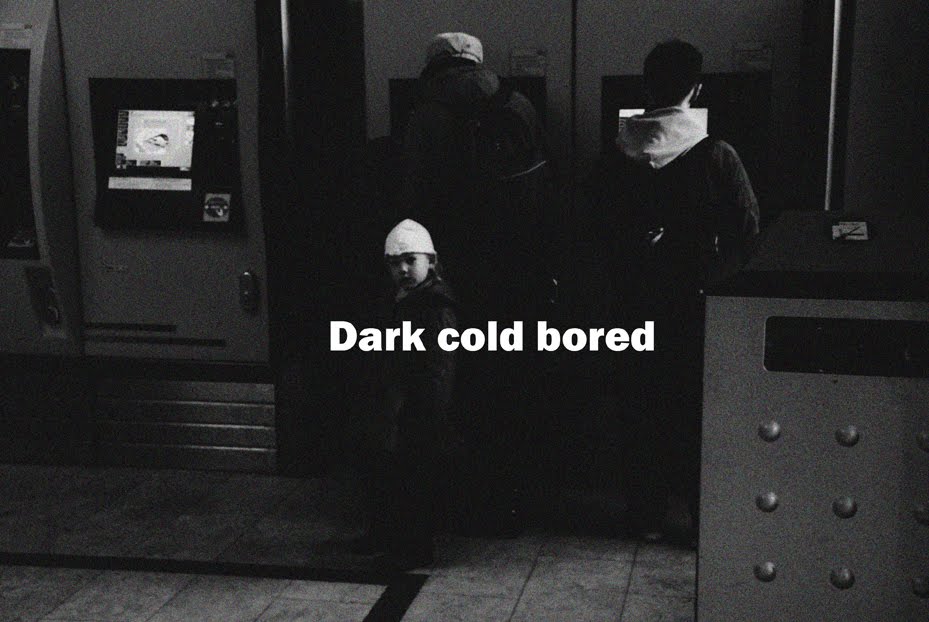
A. a picture of old delft station's window painting
B. a blue triangular picture with words and new delft spoorzone showing
A. a picture of old delft station's window painting
B. a blue triangular picture with words and new delft spoorzone showing
The poster choose black and white as main color, cause the sender want to show basic informations directly to receivers (people can see considerable detail in black and white images because black-white detail it is only necessary for black and white parts of the image to fall on two or more different cone receptors). People can get the information quickly from this poster-a baby( New Life) and an old building (old delft spoorzone),
The poster also use two kinds of contrast: Luminance contrast & Chromatic contrast
The most important single principle in the use of color is that whenever detailed information is to be shown, lunibance contrast is necessary. Of course, black and white give the most extreme contrast possible, so the main types of this poster use white color setting in the shadow part of the poster.
Perhaps the most important use of color is to indicate categories of information. In this poster, color codes are used to show different information zones. The little blue triangel part makes larger the chromatic difference between the old black-white picture and new delft spoorzone symbols, this contrast make it easier for reading and searching.
People's view is guiding like this:
Black white picture - Blue part - White Type information
Black white picture - Blue part - White Type information
Group 06 SALLVCD: You did a good job on using the contrast of blue with black & white to show the new versus the old situation. Text on the bottom is too big and distracts. Logo upper right is surplus.
ReplyDeleteWe can not derive the receiver from your poster. Image of the baby is not directly linked to the topic.
I like that you used chromatic contrast, it is always affective. There also is a nice contrast and the white “is coming” stands out.
ReplyDeleteThe old Delft is something removing, like an old boring black-and-white poster from the wall, and new nice Delft underneath. I also like the metaphor of the old as an old building and the new as a baby.
But the story gets a bit confusing, because the new (baby) is in the same image as the removing old one. Also the contrast for the “new” is less, the picture of the people in the background is distracting and the text message of the blue part disappears a bit. But in general the poster looks affective.
Natalia
group 26 INVISIBLE