Tuesday, June 22, 2010

The Maps (Finalfinal)


We did some changes according to the testing
and then made our final maps fianlly~:P


1. Add one icon to fufill the empty space in shopping area
2. Increase the right road's length for Museum Route
3. Reduce the brightness of shopping icons in Museum Route
4. Delete the key to symbols, modify some details

you can find the testing ones in former blog page~

Theoretical part of the map

Here the relevant theory from the book Colin Ware’s ‘Visual Thinking for Design’ will be described concerning our design of the map.

Standing-out: color

The bright color (orange) shopping icons stand out with the cool (blue) background. The dark blue museum icons are less outstanding, but it color reflects the Delft’s Blue identity. This is based on the Chromatic contrast [CH 4] to distinguish and emphasize the difference of grouping in the icons. The shopping icons looks different but shares the same color, which gives the information of being a group, while each location provides its unique activity.

Elongation

Elongation (which is actually an effect of the orientation in standing or lying icons) was perceived, to indicate difference. During the test some subjects indicated this as one of the first differences between the two maps. The lying and standing icon was not clear, this can be improved by adding cast shadow and more perspective techniques on the icons. The latter one will improve the standing out effect of the icons from the background and the map and also the effect of creating depth when the icons are lying down on the map.

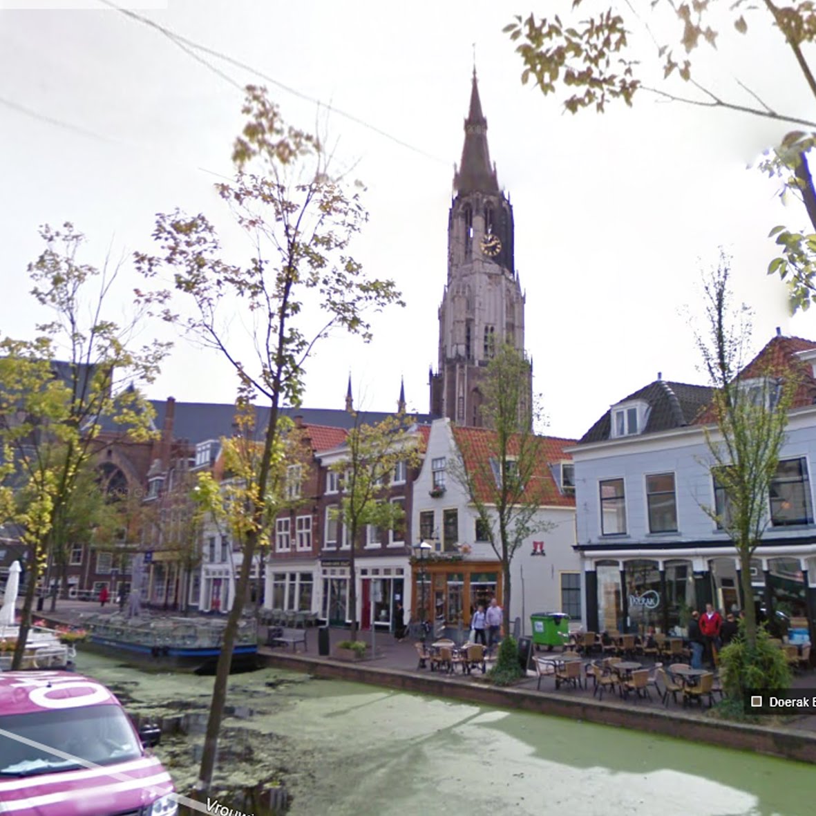
CH3: Generalized contour

General Contour is used to indicate the churches as landmarks in a simplified way. These two landmarks were very effective and attractive due its styling on the map. By simplifying the churches to its contour the test subjects perceived a simplified identification of those two recognizable buildings, knowing that these two are important landmarks in Delft.

CH3: Spatial Layout

Spatial Layout gave an extra emphasize on the grouping of the two icon groups. The space it took was perceived to be related to the amount of activity occurred on that location. So the more they were clustered, the more the people perceived to engage in a location with more activities. So clustered icons would attract more people to go to that place.

CH5: Size gradients not used on the icons which has the effect that the museums farther away are bigger than the museums close to you (the ones lower on the map), although the size of the icons are exactly the same. We did not consider making different sized icons, because it can also be misinterpreted due its importance to the city or other ranking characteristics.

CH5: perspective through texture gradients is the technique we applied to make the map look 3D.

CH5: height on the picture plane

Heigh on the picture plane is the basic to show that the location indicated by the icon is further away then the location of icons closer to you.

The railway and the canal are used for the orientation of the map from the point of where the user stands. These two gives the boundary of the city center map. The railway is shown in the well-known pattern used also on the general maps. The canal is indicated with a light blue color which is used as the color for water in general maps.

The perspective of the two maps are different, which was a experiment to test if a specific perspective can make the user become more favoring to a certain direction (left or right from the starting station) as another. This has not yet proven clearly, but during our small user test it gave indication about whether or not one perspective is leading them toward the center or away from the center.

Sunday, June 20, 2010

Data analysis (week 9)

Based on the test, all the participants recognize there is difference between two maps. 10 people (50%) mentioned the icons, and 6 people (30%) mentioned the curve of the maps is different. There 13 participant (65%) choose the right direction which is supposed to be given by the map. The reason why 7 participants chose the wrong direction is focusing on two aspects, one is because the shopping area looks like emptier, so they chose the museum. The other is because one road is shorter, so they will choose the shorter one. The rest reasons are their personal preference (Shopping preference or museum preference).

The results for the two maps can be concluded as follow:
- The testing maps can achieve the goal, leading people to the proper direction which they suppose to. But they still need small improvements.
- The shopping area should be improved. People should not feel that area is emptier than the museum area.
- The distance of the road should not impact so much, people always like to choose the shorter way.

There is an extra interesting finding is that the position where people standing also can influence the decision. Such like if people stand on the left of the map he might choose the right direction, because he is looking into that direction. This point can be studied in the further research.

Test Data

We got twenty participants for this test. The data is documented in this table for the further study.

Wednesday, June 16, 2010

User Testing

We took our maps testing in Rotterdam in the morning. For we thought the people who are in station maybe have been to Delft or rush doing the test by coming trains, we took it on the street with leisure people.

Wanglong Li as our dutch speaking interviewer
Chengfei He as the note taker
Xiang Yu as the observer & photographer


The testing got positive feedback for our concepts~
but the reasons for choice making from different participants
always give us new inspirations~

Maps after tutor meeting & improving (week 8)


Monday, June 14, 2010

Icons' research & making


Our Icons


Build & Curve


Build the basic map in Rhinos~

Concept Improvement - Face to u (draft version) (week 7)

After checking the museum and shopping routes, we get the
idea that we could add another simple concept-make the
icons face to visitor, like we talked about last time, mixed the billboard
concept together with the map information.

So, in Museum route, the museum icons will face to the people's view, and the shopping
icons will be flat, in Shopping Route, it's opposite~


Museum Route


Shopping Route

Sunday, June 6, 2010

Concept~ Mix perspective view with billboard

After the route exploration and experimentation with 2d map blended with 3d perspective on the foreground. There's a new idea come to my mind... how about mixing perspective view concept with billboard? That will also use the experimentation things we did, but not bending so much, just upward a little bit, looks like a billboard on your the way of your "destination"~ hope it will work well on attention attracting in a natural & unconscious way after improvement~


Friday, June 4, 2010

Experimentation


Some experimentation with 2d map blended with 3d perspective on the foreground.

Thursday, June 3, 2010

Delft city tour (week 6)


Happy city tour in a strong rain~~


Wednesday, May 26, 2010


Perspective theory from Visual Thinking for Design

Saturday, May 22, 2010

Experiment of another idea


Here a quick and dirty experimentation of our other idea; but it shows some cognitive difficulties to implement it into a "map".

The starting point here would be that some people memorizes a route by the images of landmarks. Some images is places in a certain sequence showing the order; the perspective view of the image suggests guidance of the route by showing on which side this image is taken. And therefore maybe how the you as tourist should navigate through the cityroute.

Images (googlemaps)

For the concept to work, we need some landmarks of the route in the city of Delft.
Here are some examples on the internet, but probably we need to explore by ourselves and take some effort/time to let this work.


Analysis assignment (week 5)

-Two versions (museum route & shopping route) of the poster: 6 x 8 m


-No prominent text usage (exception of names)

-Route line as primary indicator for direction is not allowed


-No arrow(likes) allowed

-No legenda usage

-Differences between the two versions should be subtle


Deadlines/Deliverables:
23 May digital concept
26 May during lecture, A3 copy of concept
23 June Final design hand-in and presentation

Our basic ideas:
Transform top view to perspective view


Use Color, Angular perspective, Blur for guiding


This concept can be emphasized by using exagerated perspective like semi-fisheye effect; the idea is to direct them through perspective, instead of signs or dominant colour usage.


Maps of Delft and some Inspiration

One of the great expressions of Delft's civic pride was the publication (first volume 1667) of Dirck van Bleyswyck's Beschryvinge der Stadt Delft, "The Description of Delft," an invaluable 900 page history of the city and one of the most ambitious 17th c. projects of its kind. Van Bleyswijck (1639-1681) was born into a prominent family and was sheriff, orphan master and burgomaster as well. He is known to have traveled extensively throughout the 17 Provinces.


Delft map: Museums


Perspective Maps:


Colorful Building' Icons: